Get Zen —
A brand identity helping to deliver a fresh perspective on mental health in the workplace.
Project overview —
Zipporah & Northstar approached the Tidy Agency to help develop an identity system to support their extensive new mental health and wellness platform — GetZen. The brief also included an update of their existing brand and a further brief to design and build the platform itself.

Our Approach —
To better understand Get Zen as a brand, we created a system that would help identify and define the different areas and emotional aspects within the business. They were broken down into 4 key elements (Water, Air, Fire and Earth — each representing a part of the business and an emotional/action association.
We created a supporting graphic system that defines the four key brand pillars within the GetZen platform.The graphic symbols represent the 4 elements — Water / Revive — Air / Reset — Fire / Invigorate — Earth / Ground
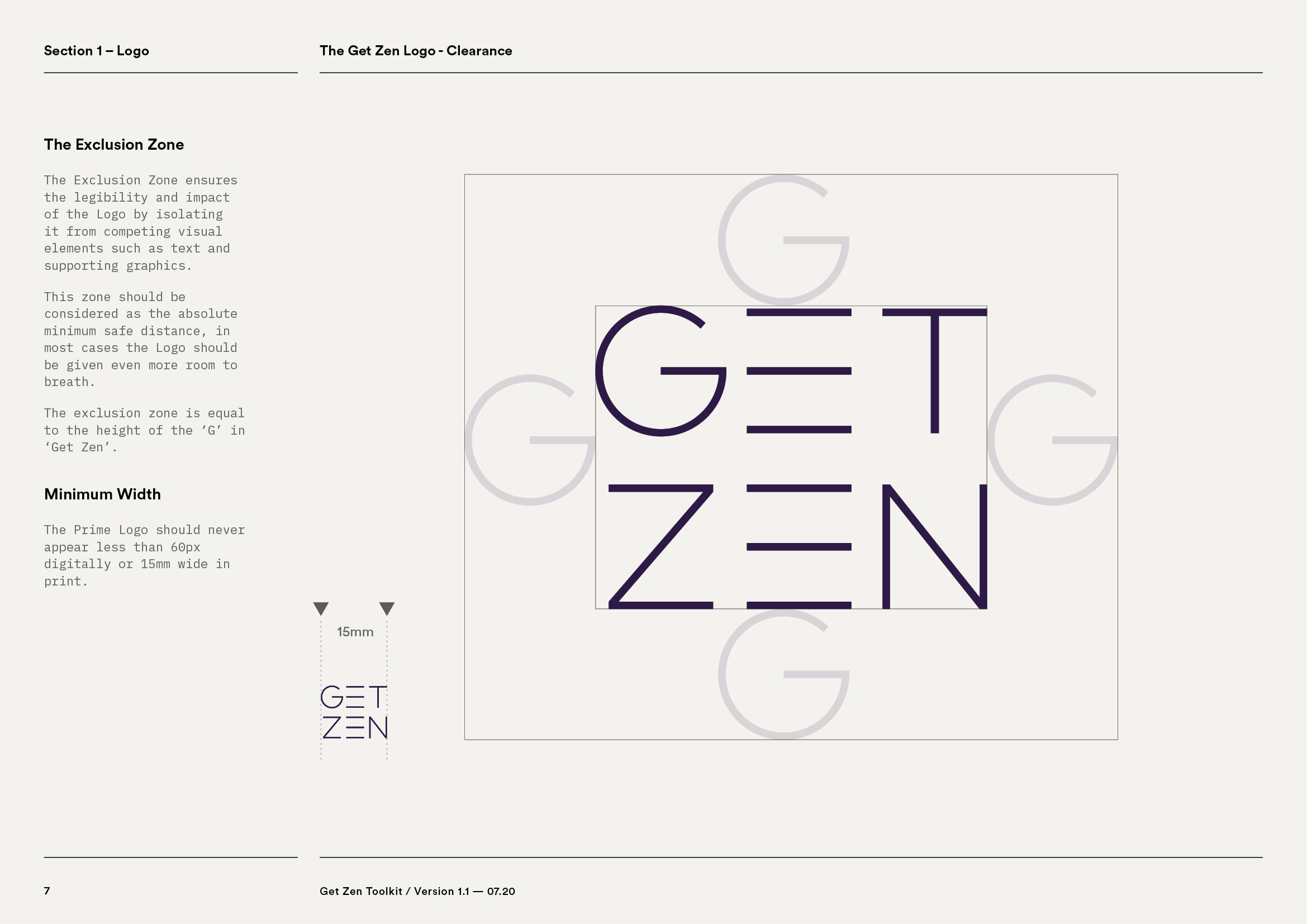
The GetZen logo embodies progress, development, improvement and equilibrium — the 6 lines are a graphical representation of this.


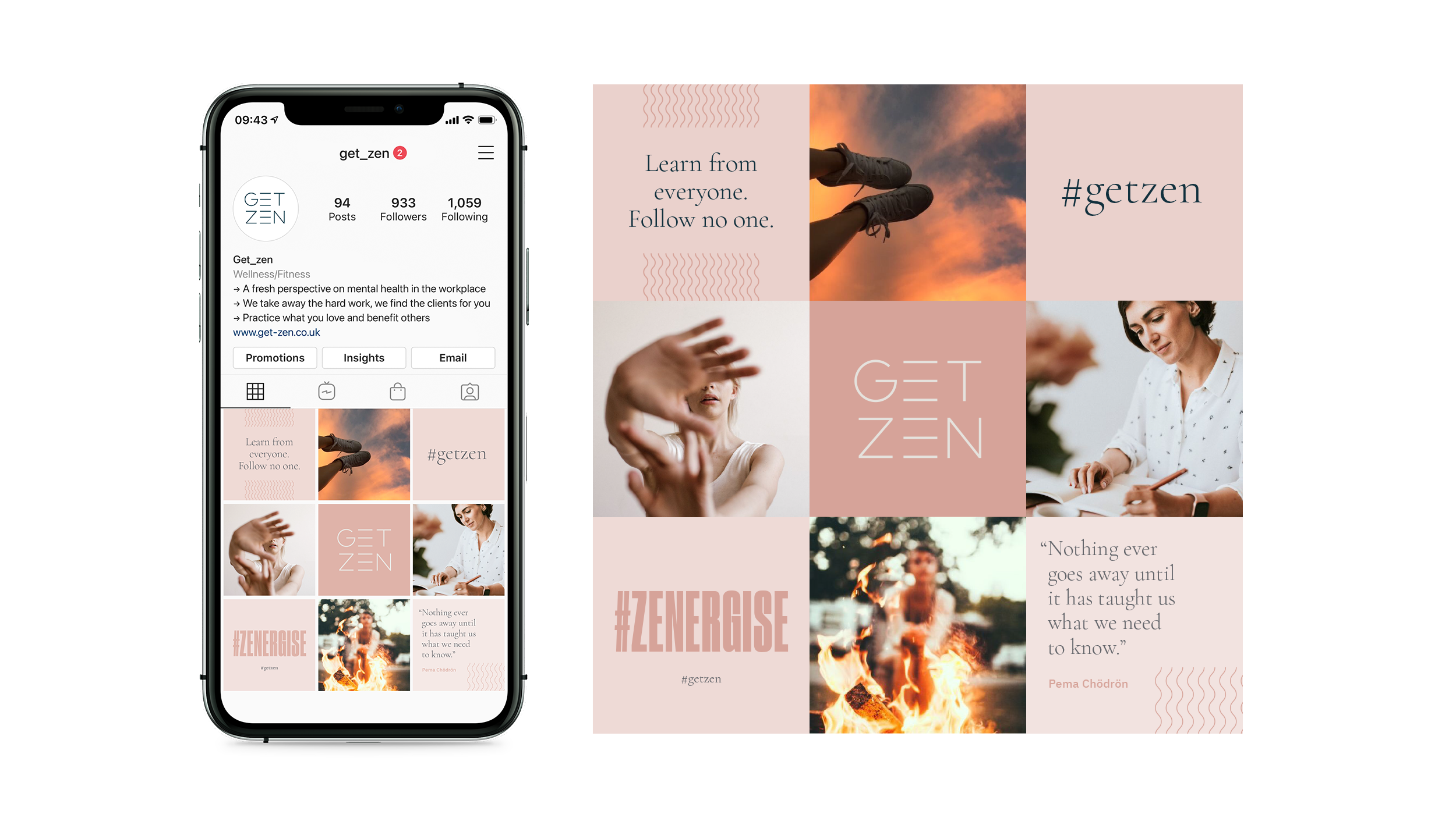
We designed and supplied a full suite of assets and user guide for Instagram for each of the key sectors within the business that was easy to use and create effective content from
From our client…
“Working with Tidy + Able on creating our branding has been a fantastic experience from start to finish. Tidy + Able are the right type of perfectionists that we needed when creating a vision so close to our hearts. We trusted them completely to dramatically change our initial look and feel and they did not disappoint. Tidy + Able are professional, approachable and will go above and beyond without hesitation, as they understand the importance of making a business look good. We cannot recommend them highly enough.”
— Frankie + Katy / Founders
Our remit included:
Brand Identity
Supporting Collateral
Brand Values + Strategy
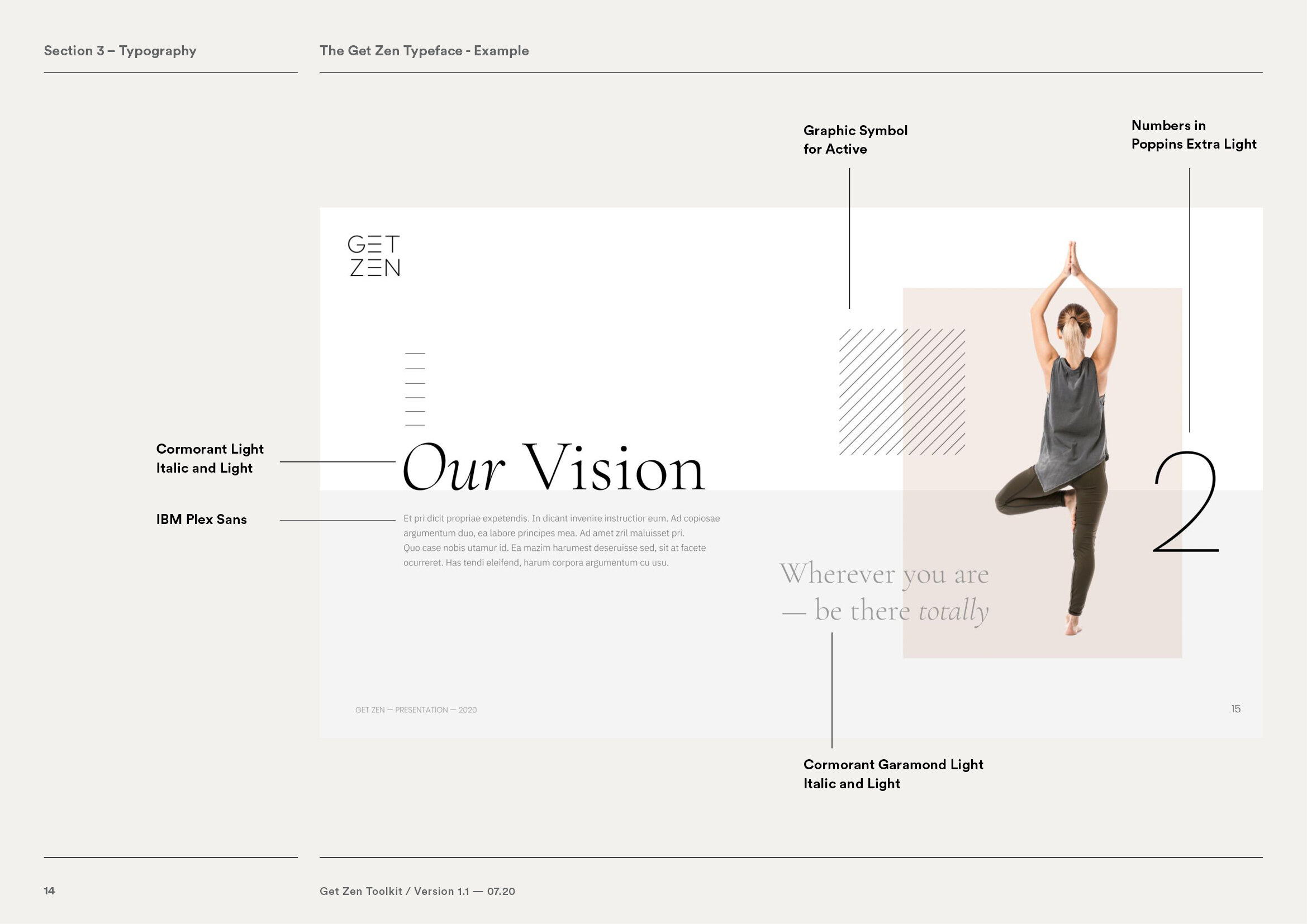
Presentation Design
Web Design


